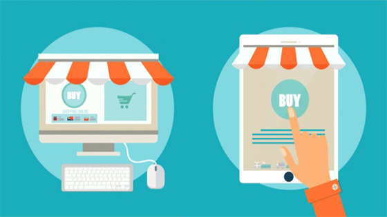
Businesses don't realize that the design of their ecommerce website has a direct impact on their sales. Even a small change in the design elements can improve or decline your sales online. This blog will discuss five things which can boost your ecommerce website’s online sales.
Designing your ecommerce website in user’s perspective is essential. But most businesses don't keep this in mind while developing their website. Some gets too artsy with their web design. Others use too much of flash animations which will slow down the website speed. Some others choose wrong color schemes which might confuse the users.
Here are five tips by which you can turn your target audience into your website visitors and then turn them into your customers.
Visible Shopping Cart:
Make sure you have an area on the page, at all the time till checkout, to display shopping cart. So, the customer can keep track of their purchase. This will help the customer have a peaceful mind which in turn can increase their interest to do more browsing of your products. More browsing can give you more sales.
Attractive “add-to-cart” button:
Make sure your add-to-cart button have an engaging call to action text. For example, “buy now” text can be more engaging than “more details” or “learn more”. Secondly coloring your “add-to-cart” also should be given much attention. Generally Blue and green are used most for a positive response while orange or red can have a negative impact. Using color which suits your website’s theme color can make it more attractive.
Clear Product Pages:
The way you organize your website’s product page is so crucial to keep the visitor engaged and make them place an order. Make sure the first thing a visitor see while landing on the product page is the product image. So, the visitor might get a clear picture of how the product looks like. Other things like customer reviews and related products links can be kept as close as possible to the bottom of the page.
Easy Navigation:
Use breadcrumbs so customers can trace their way back to the previous category with a smooth navigation experience. Don't be too artistic with the design of your navigational elements. The simpler it is more conversions possible. A “continue shopping” option after adding a product to the cart is also good way to get more sales.
Simple Checkout page:
Single page checkouts have the most conversion rates. In single page customer should be able to fill their shipping, billing and credit card details. One-click checkout is an easy way to have repeated customers.